To help us communicate as a unified and professional brand, we have formulated our layouts. This allows us to develop clear messaging, maintain aesthetic balance and build consistent digital and print assets.
Logos
Scale and proportion
As a general rule, the logo should take up no less than 20% (and no more than 80%) of the working area. When determining exact size, remember that each application is unique.
Here are a few examples of logo placement and proportion. Preferably, the logo will be placed in the bottom left corner. As we’ve shown, however, it can be moved around when different layouts are used.


Preferred position
The logo must be positioned to create an impactful visual and ensure consistency across all collateral. As a general rule, the logo should be anchored in the bottom left corner.
However, if an alternative is required, the logo can be placed in an opposite corner. When working with alternate sizing and dimensions, you may need to align the logo to the centre axis instead of a corner.
When considering the placement of a logo, always ensure that it contrasts significantly with the background.


Lock-up
We use a universal logo and URL footer or header on all of our applications. This is referred to as the logo lock-up. Whenever possible, the lock-up should be used to maintain a consistent visual across communications. The lock-up can include all variations of the logo, excluding the short logo.
When designing a layout, use the height and width of the UBC crest to create margins that are proportional to the logo lock-up. The negative space between the logo, rule and URL should measure out to be the same width as the UBC crest.


Grid
Columns and rows
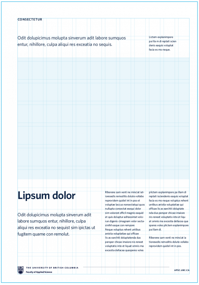
In order to create uniform layouts, we use evenly spaced grids that consist of 12 columns and 12 rows.
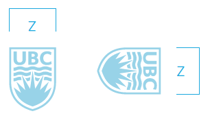
When spacing out our grids, the UBC crest can be used as a measurement tool. Working with a common tool will help build well-balanced and consistent layouts. The column and row margins should measure out to be 1/2 of the UBC crest’s width. This value is referred to as Z.


Margins
When creating margins, we follow a similar practice.
By using a common measurement tool, the UBC crest, we ensure that our layouts are optically balanced. The page’s margins should be determined by the height of the UBC crest. This value is referred to as X.


Examples
In these examples, we use the grid to create a variety of different layouts.


Graphic device
Scale and proportion
When using graphic devices, it’s important to consider the intention of the device: to illustrate connection, interconnection and innovation.
Graphic devices should not be placed haphazardly. When we apply a graphic device, we want to tell a story with its position on a page. For example, we can use key lines to draw attention to particular words or parts of a photograph.
As a general rule, the graphic device should account for no more than 60% (and no less than 30%) of the overall layout.


Crop and position
While displaying the entire graphic device works well in most applications, we can also crop or scale it to focus on particular sections. Then, these sections can be positioned on the page to frame specific details or create a more interesting layout.
However, when placing the graphic device, ensure that it does not intersect with the logo’s clearspace. If the graphic device happens to cross over the logo’s preferred placement area, you may move the logo to a different corner.


Photography
Overlay
To create additional contrast, we occasionally add a tint layer. When tinting a photograph, do not apply a colour as this will conflict with the discipline’s signature look and feel.
In this example, we only show overlapping layers to demonstrate a colour difference. Do not follow this application for final designs. All final designs should be run through the proper production procedures to ensure that all tint layers have been applied correctly.

Layer 2: Image

Freeform gradient overlay
Using the freeform gradient tool, we can isolate the focal point of the image and highlight it by centering the gradient around this point.
Standard freeform gradients (with and without transparency) can be accessed in the brand tool kit.
Use the provided assets – variations must be approved by APSC marketing and communications.


- Using the rectangle tool create a shape.
- Select the gradient tool, and apply a freeform gradient to the shape.
- Assign the discipline’s three colours to the freeform gradient.
- Then add a fourth colour (ex. white) to the area of focus in the selected photography (ex. a person’s face).
- Lastly, set the fourth colour’s opacity to 0% to make a transparent focal point.
See above panel for specific settings.
Application
Ensure that the focal point of the image is directly under the transparent anchor in the freeform gradient layer.
This is the only instance in which a user would need to adjust the freeform gradient in Adobe Illustrator.

Layer 2: Image

Schematic
Application
Our identity system can be applied to achieve a variety of looks and layouts. In this example, we use the following assets in a single layout:
- Freeform gradient
- Graphic device
- Content
- Lock-up

Download assets
The following templates are available:
- PowerPoint
- One-pagers
- Brochures
- Postcards
- Posters
- Trade banners
Download the assets from the APSC intranet – EAD\CWL login may be required.